Obao
2021–2022 | Naming, Brand Identity, Packaging, Menu, Uniform, Social Media, Signage, Launching Campaign, PR Kit, Installation
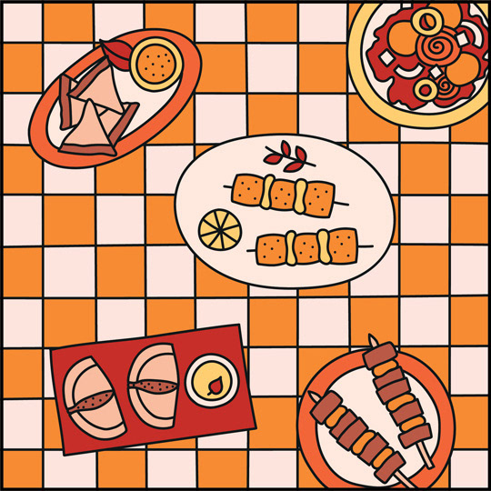
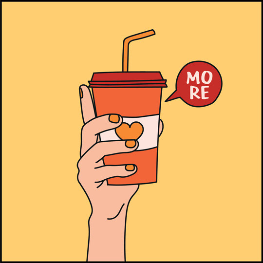
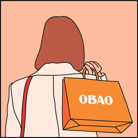
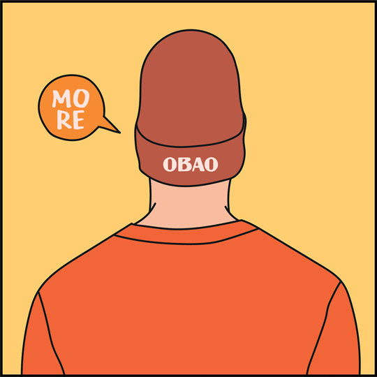
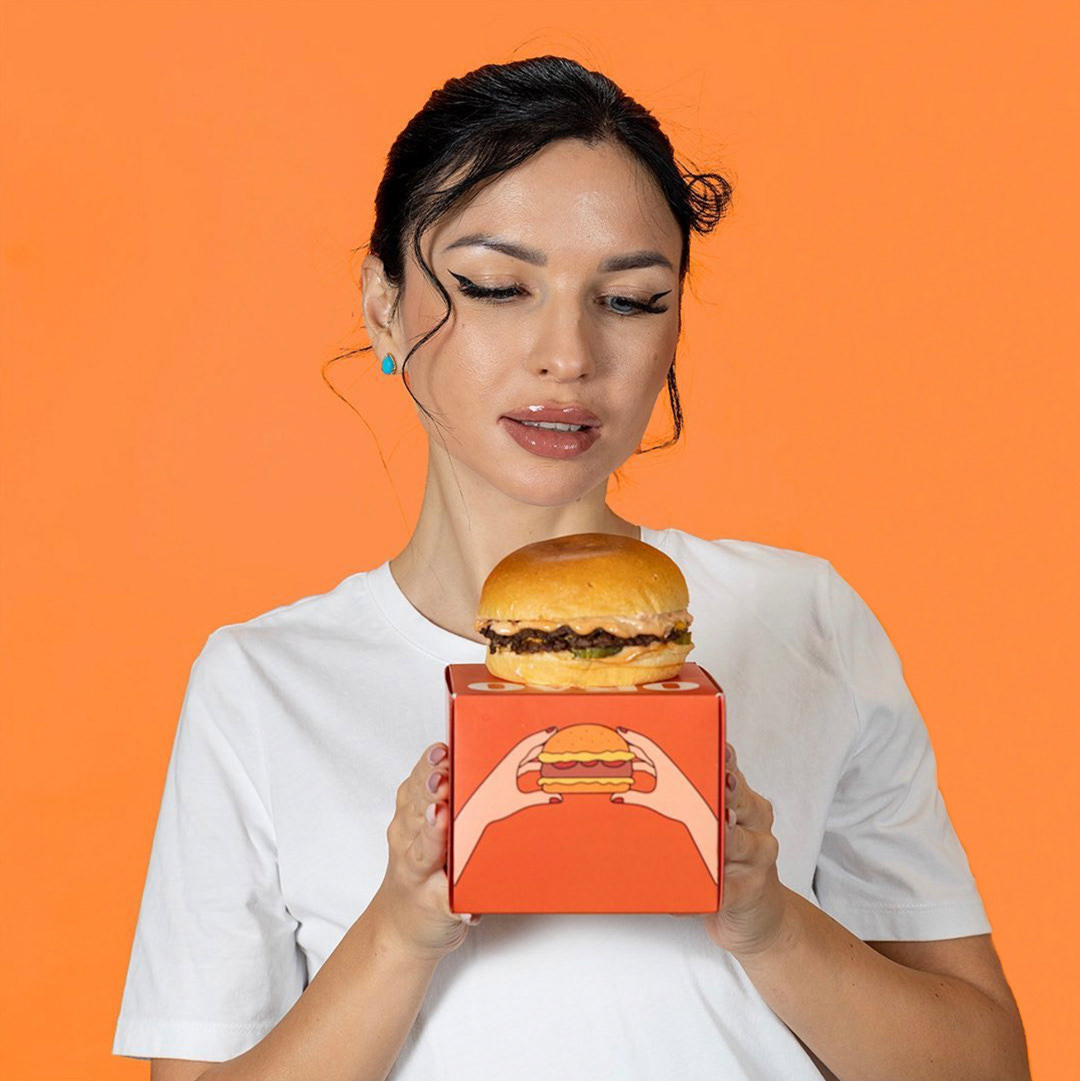
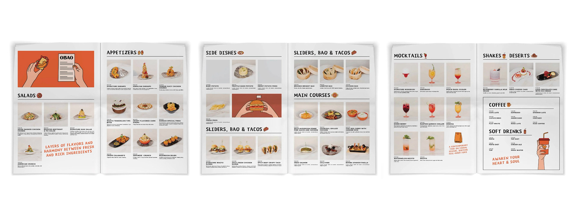
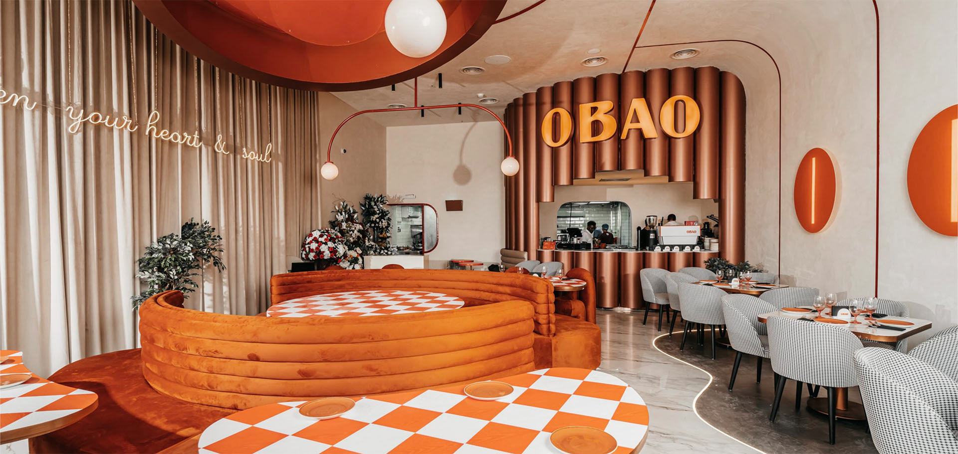
Obao delivers a quality comfort-food experience with a sense of play and liveliness. Straightforward, easygoing, and distinctive, it offers an international blend of Western and Asian cuisine. The brief was to create a fun, approachable visual identity that appeals across generations.
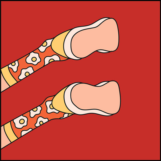
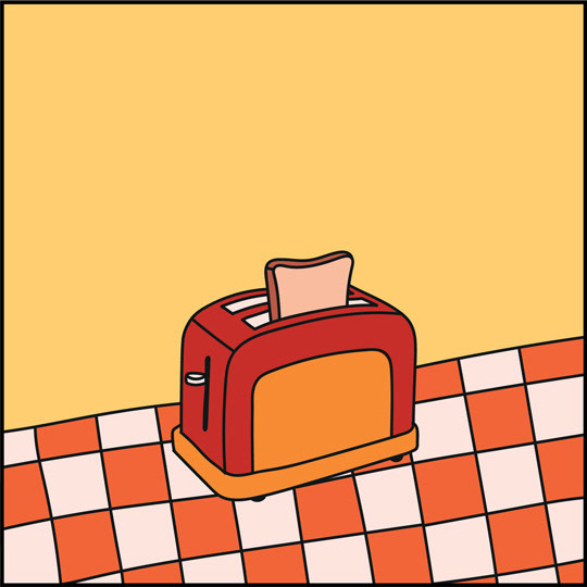
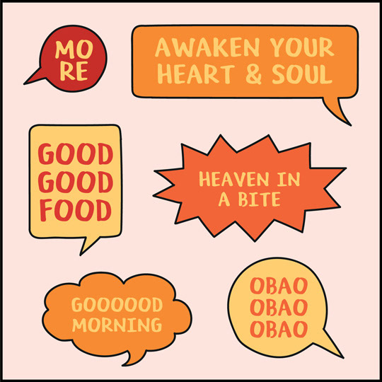
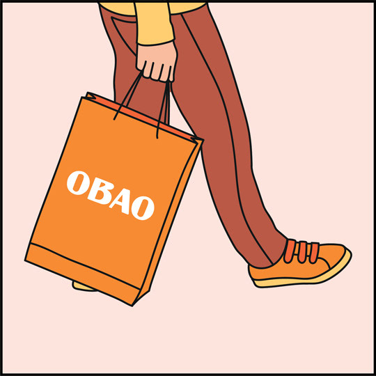
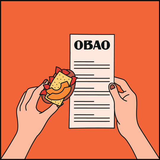
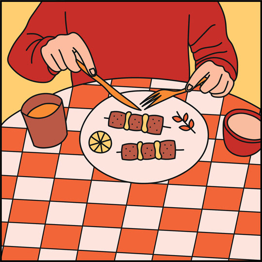
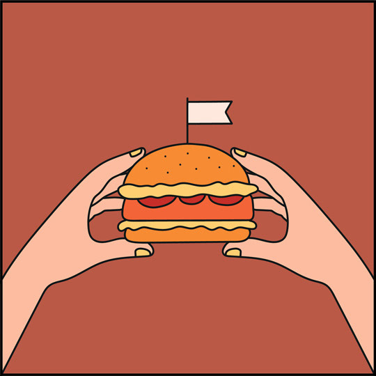
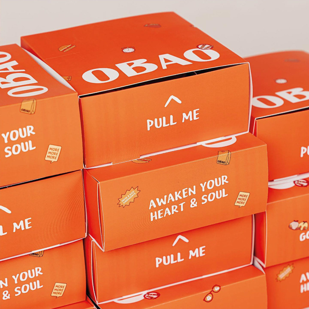
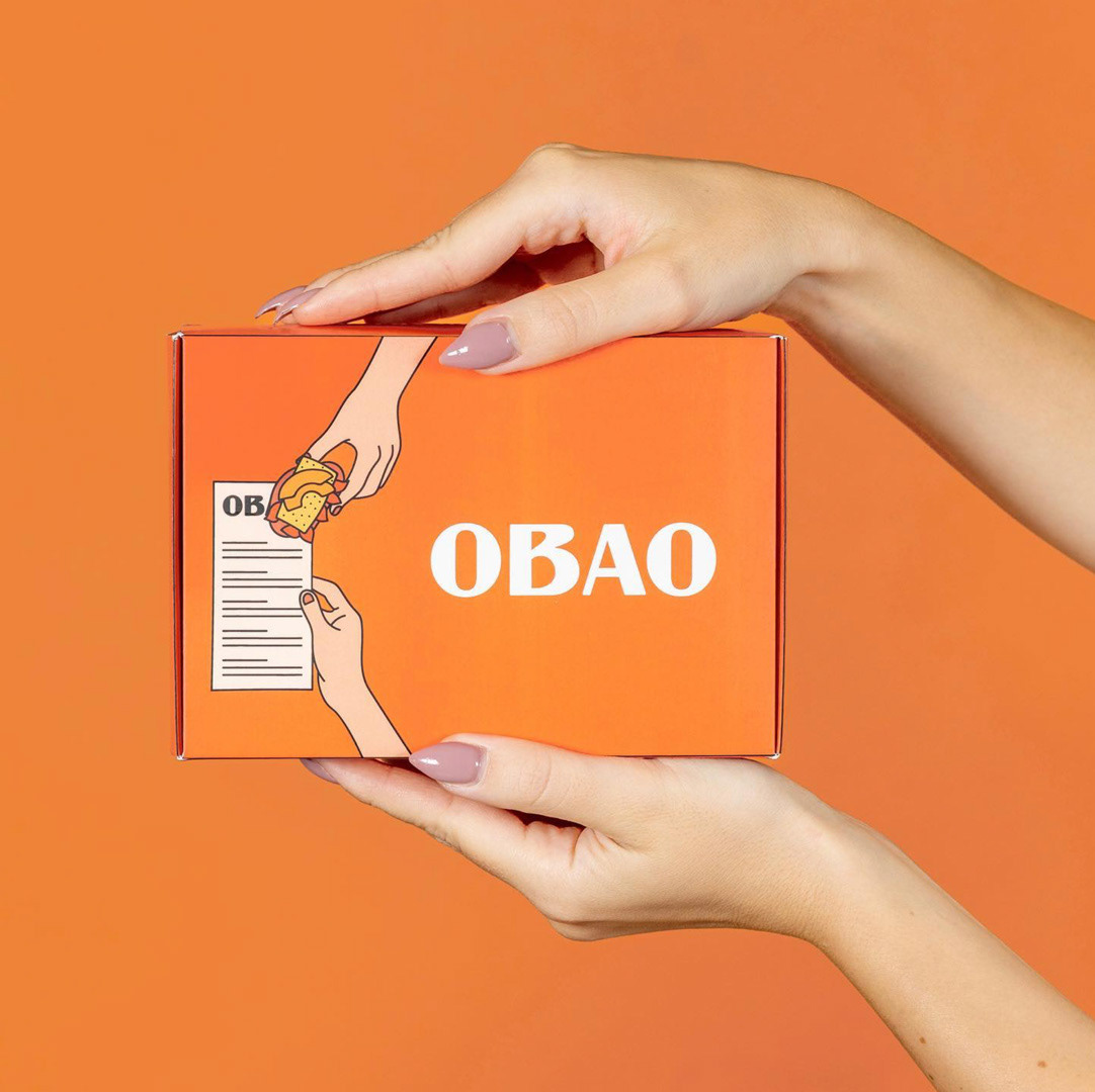
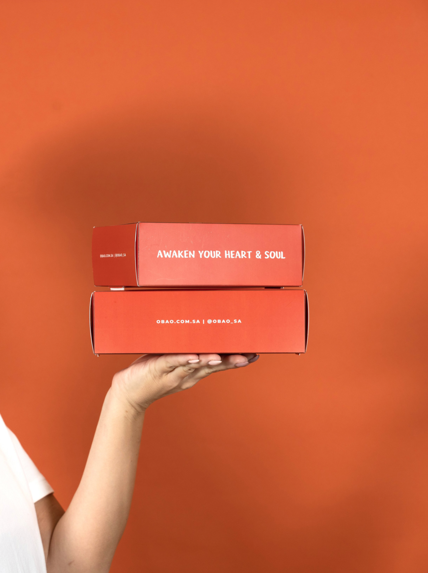
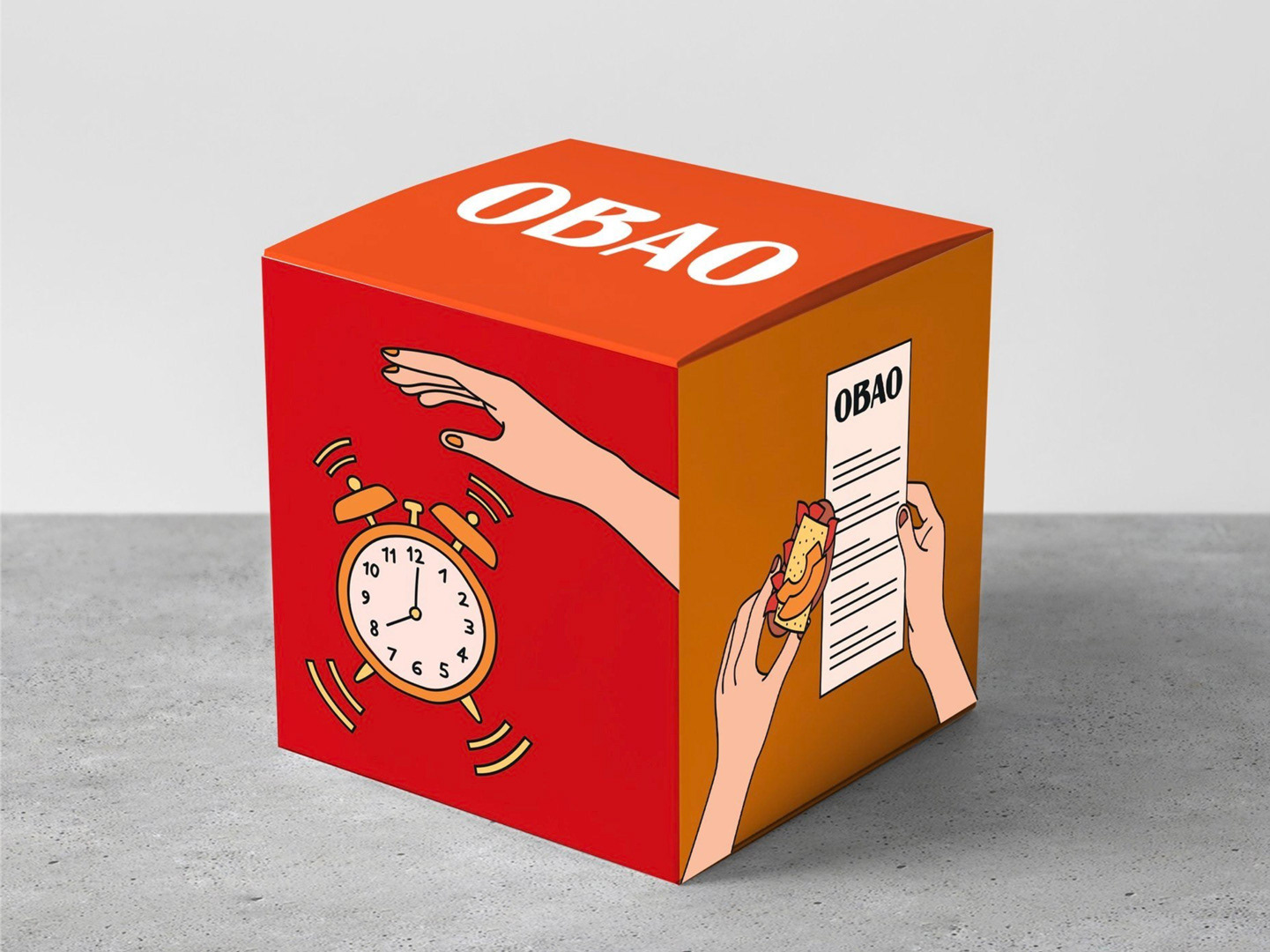
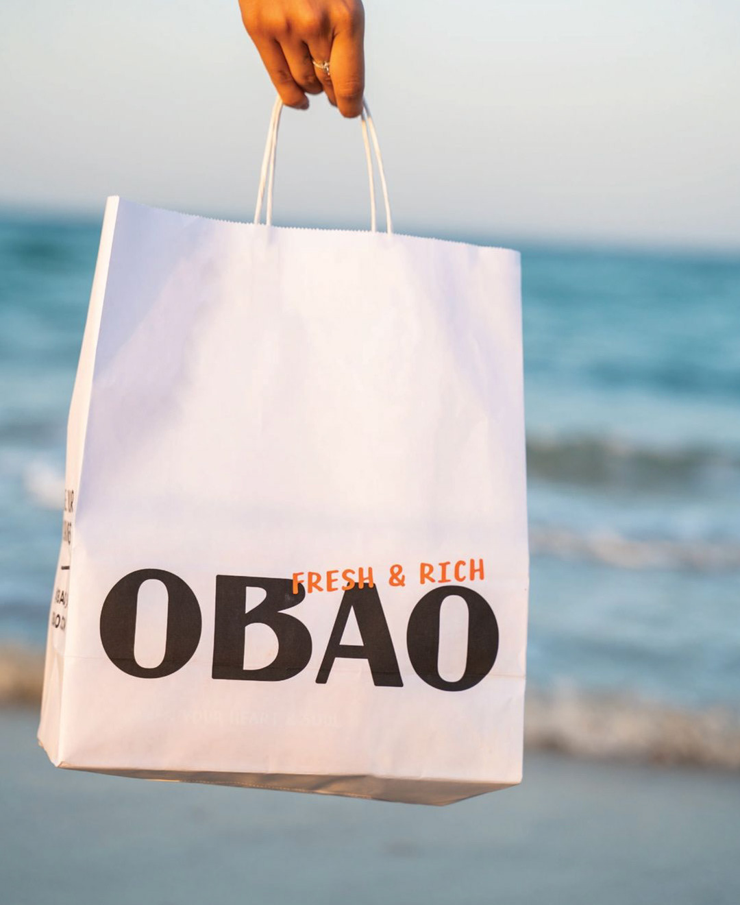
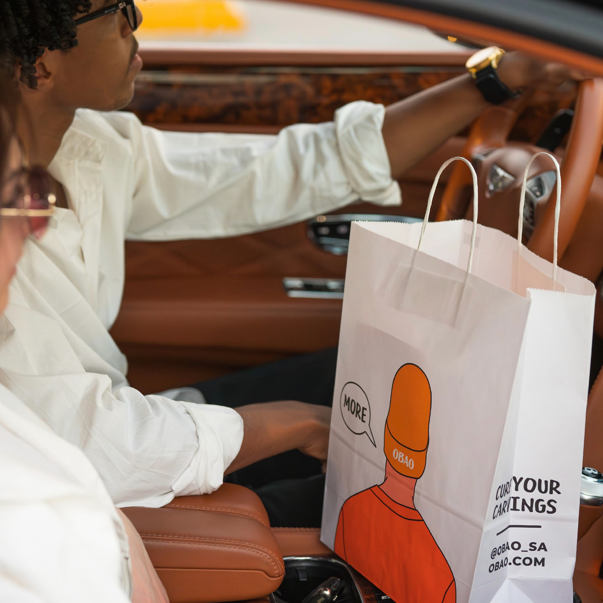
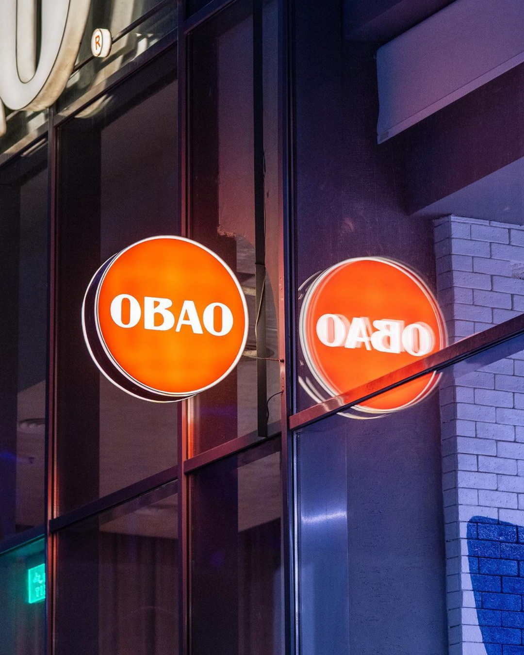
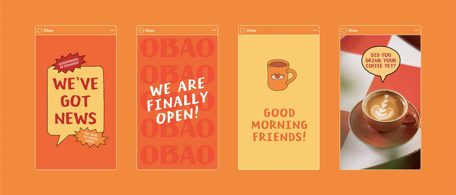
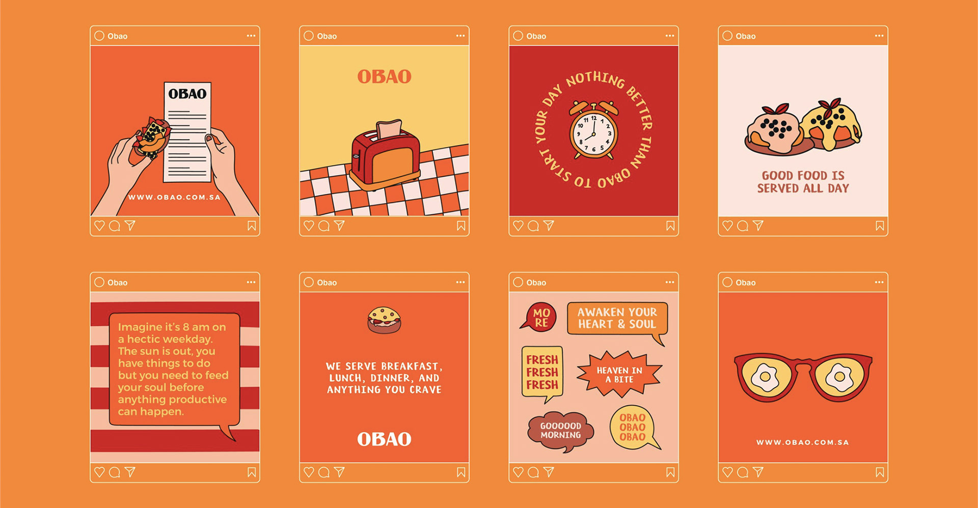
The logotype is based on a sans-serif typeface, with a twist in the counter of the letter "B" that adds an edgy note. The color palette's warm tones reflect the idea of comforting food served hot. An extensive illustration system complements the simple logotype, giving the identity flexibility and character. The illustration style draws from classic diner culture, reinterpreted through a modern, comic-inspired lens.
Creative Direction: Unkoated | Laetitia Keyrouz
Graphic Design: Chiara Vincenti Zakhia
Photography: Obao
Interior Design: Arteon Interior