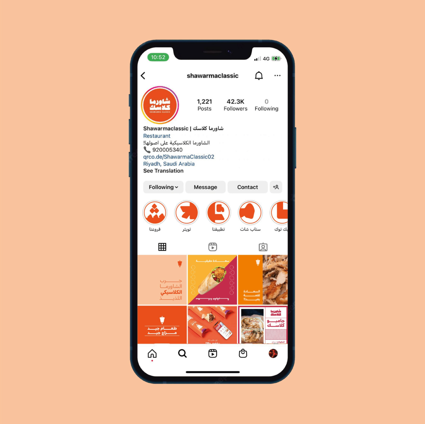
Shawarma Classic
2022 | Rebranding, Brand Identity, Packaging, Social Media, Signage
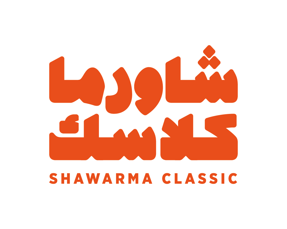
Shawarma Classic is a Saudi-based traditional shawarma shop. The project began as a brand uplift, retaining key elements of the original identity, such as the shawarma emblem, while updating the logotype and typography for a fresher, more contemporary feel.
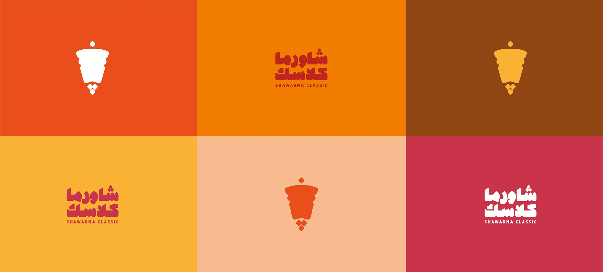
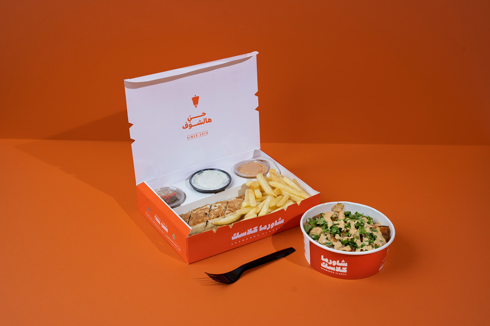
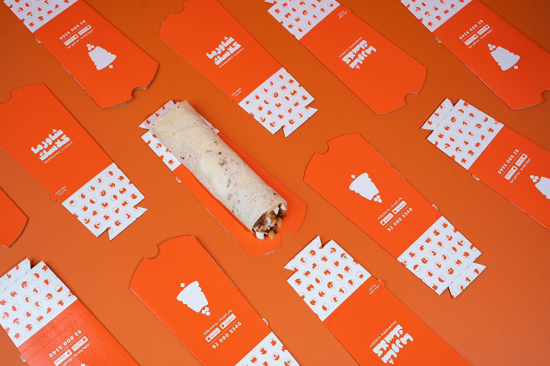
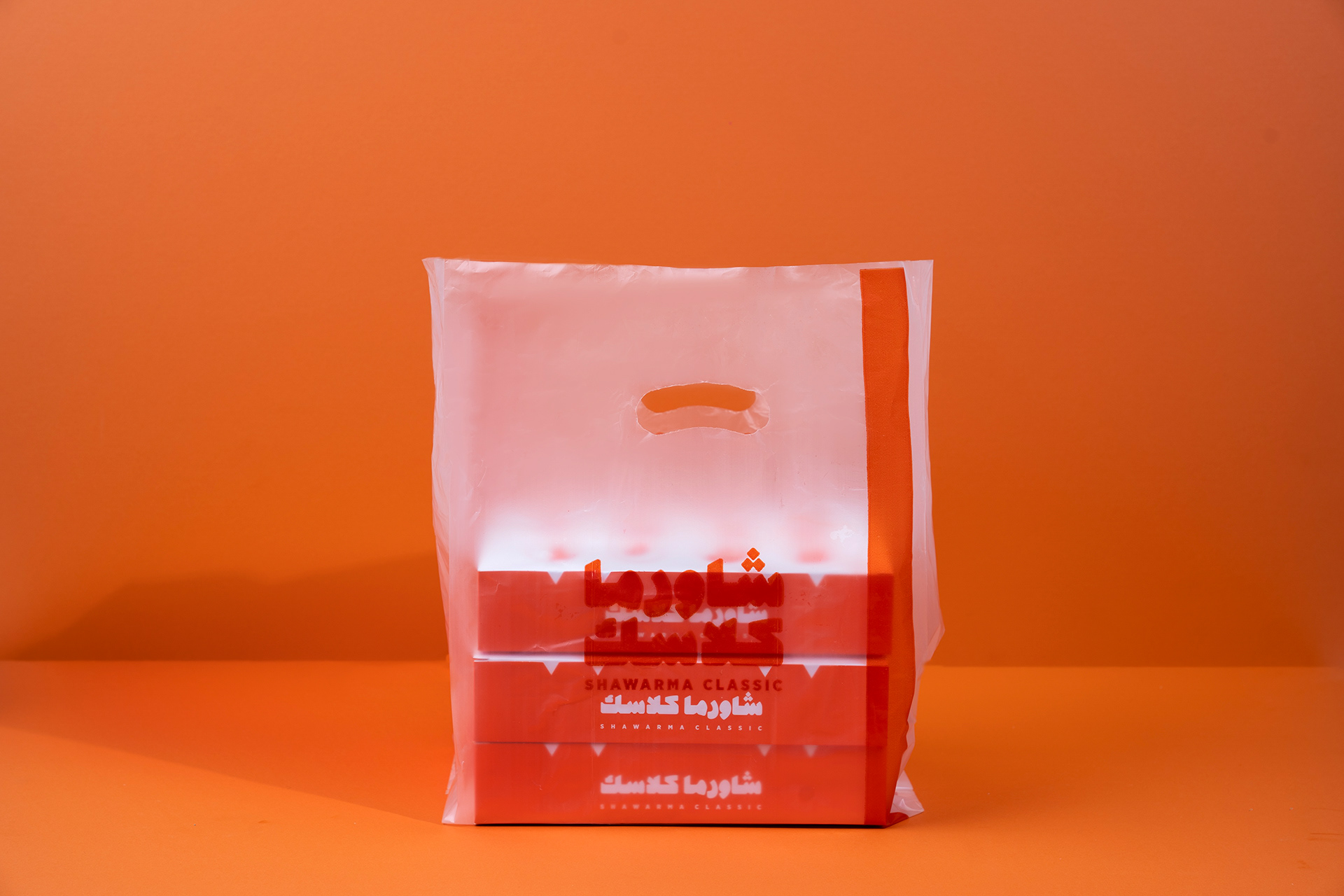
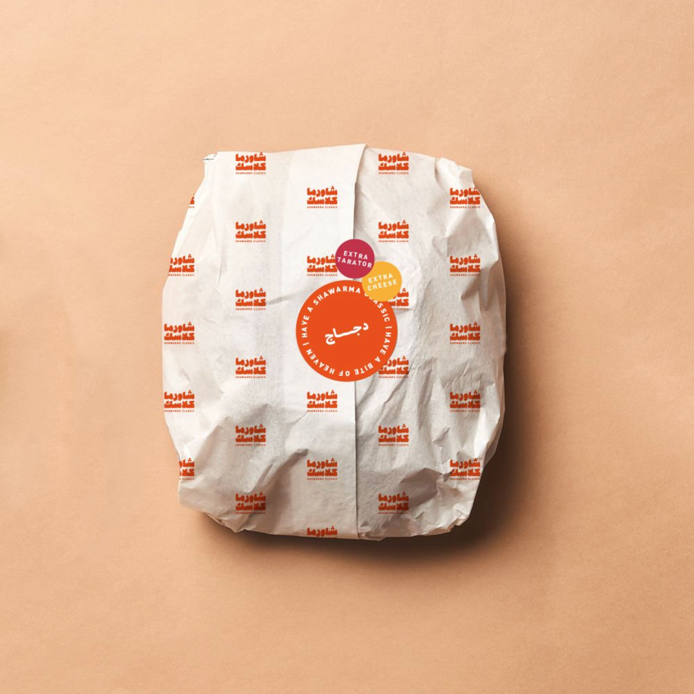
The bilingual logo prioritizes Arabic to resonate with the local audience. The Arabic logotype features thick strokes and a bold construction, creating a friendly yet assertive visual presence. The shawarma emblem was refined into a secondary logo, inspired by the Arabic letter "ش" (sheen), echoing the iconic shawarma shape while remaining consistent with the typographic style.
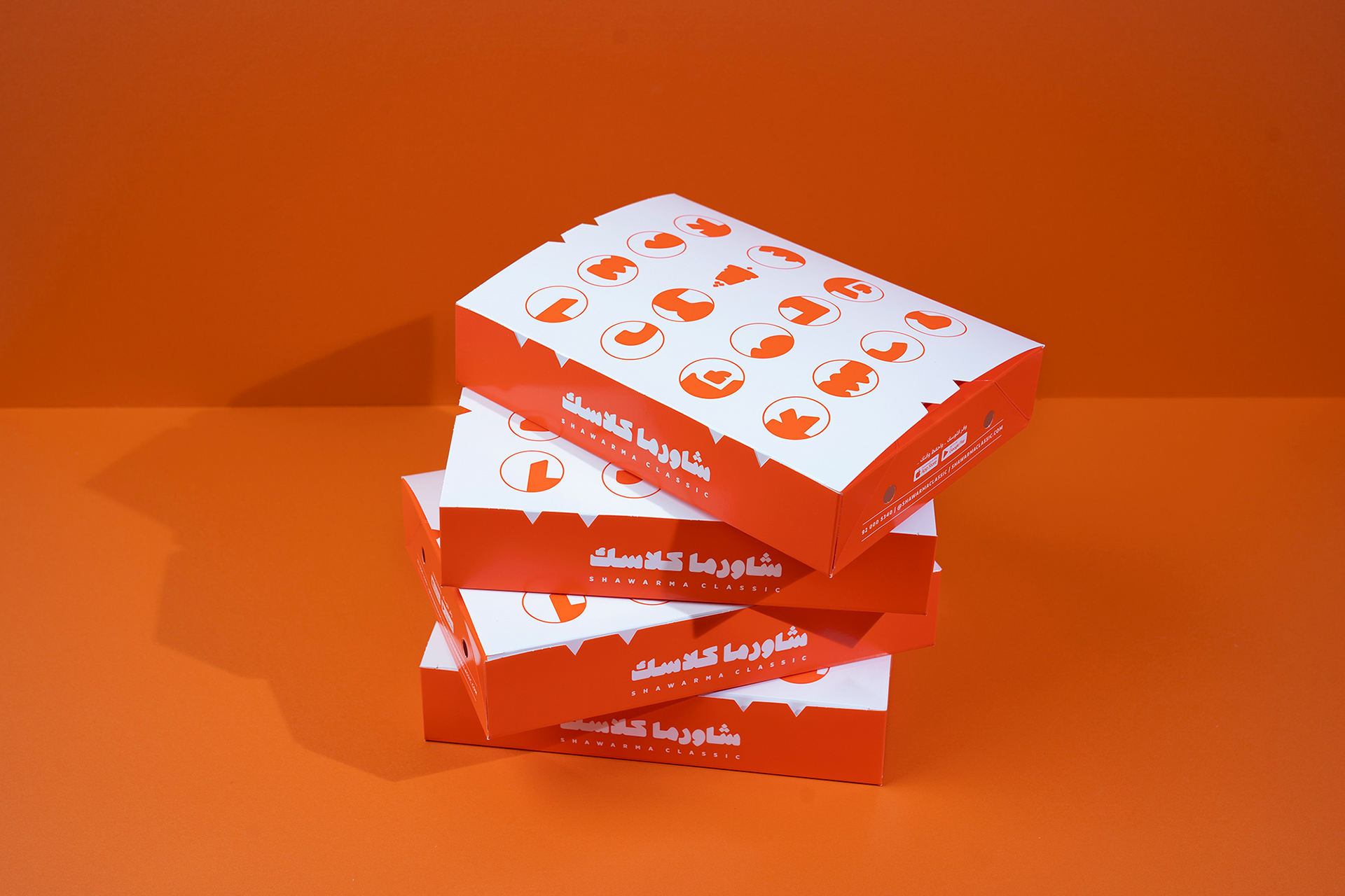
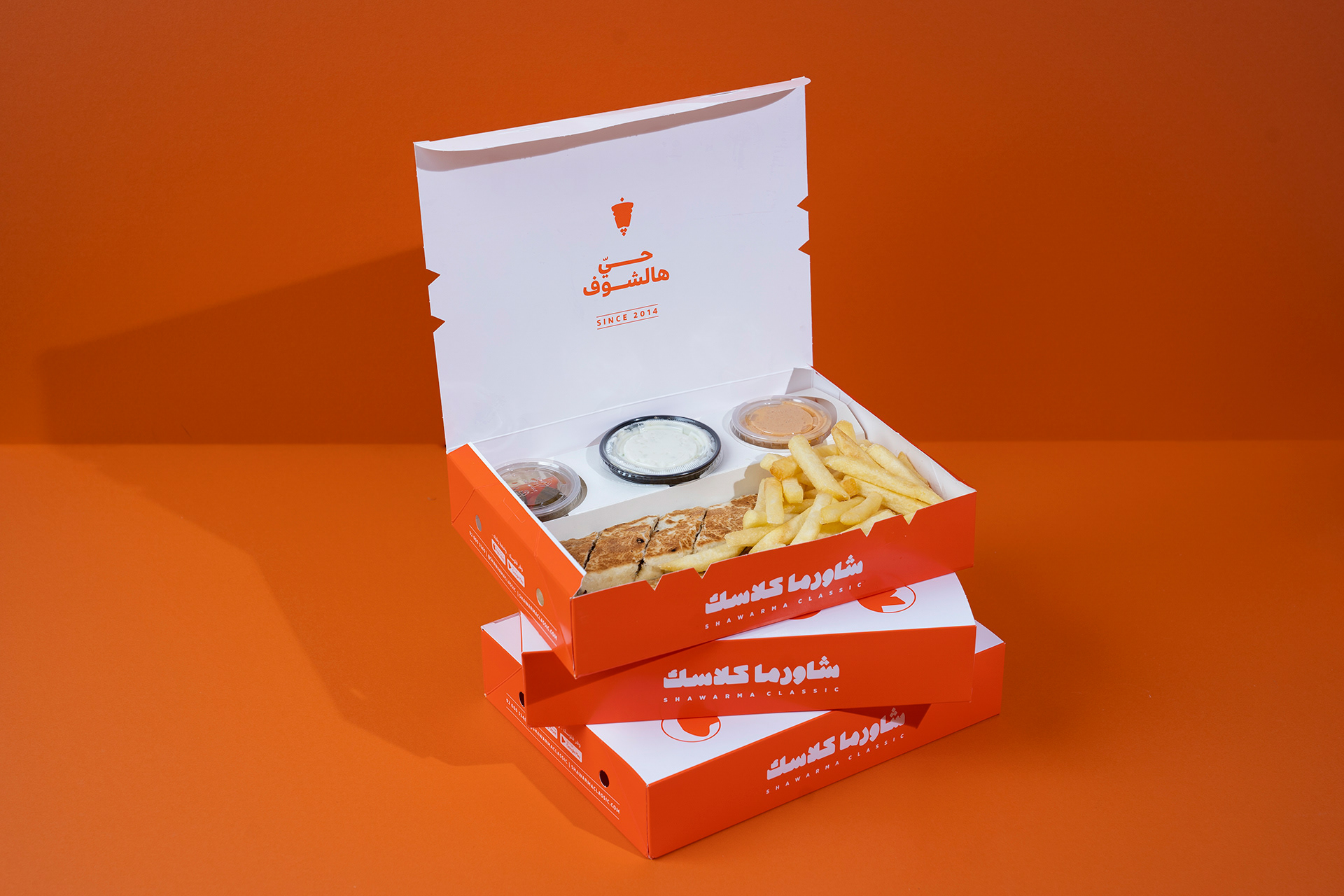
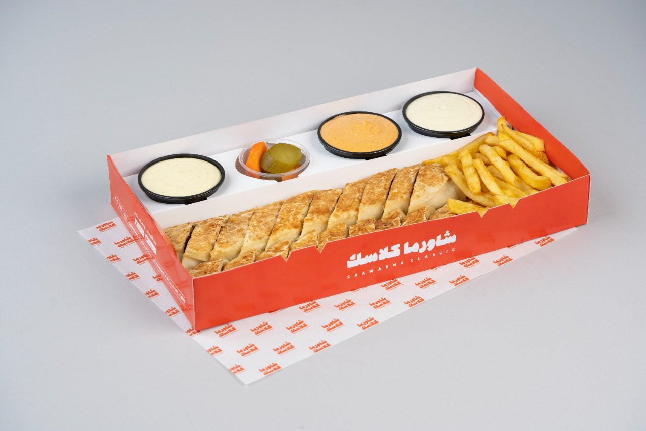
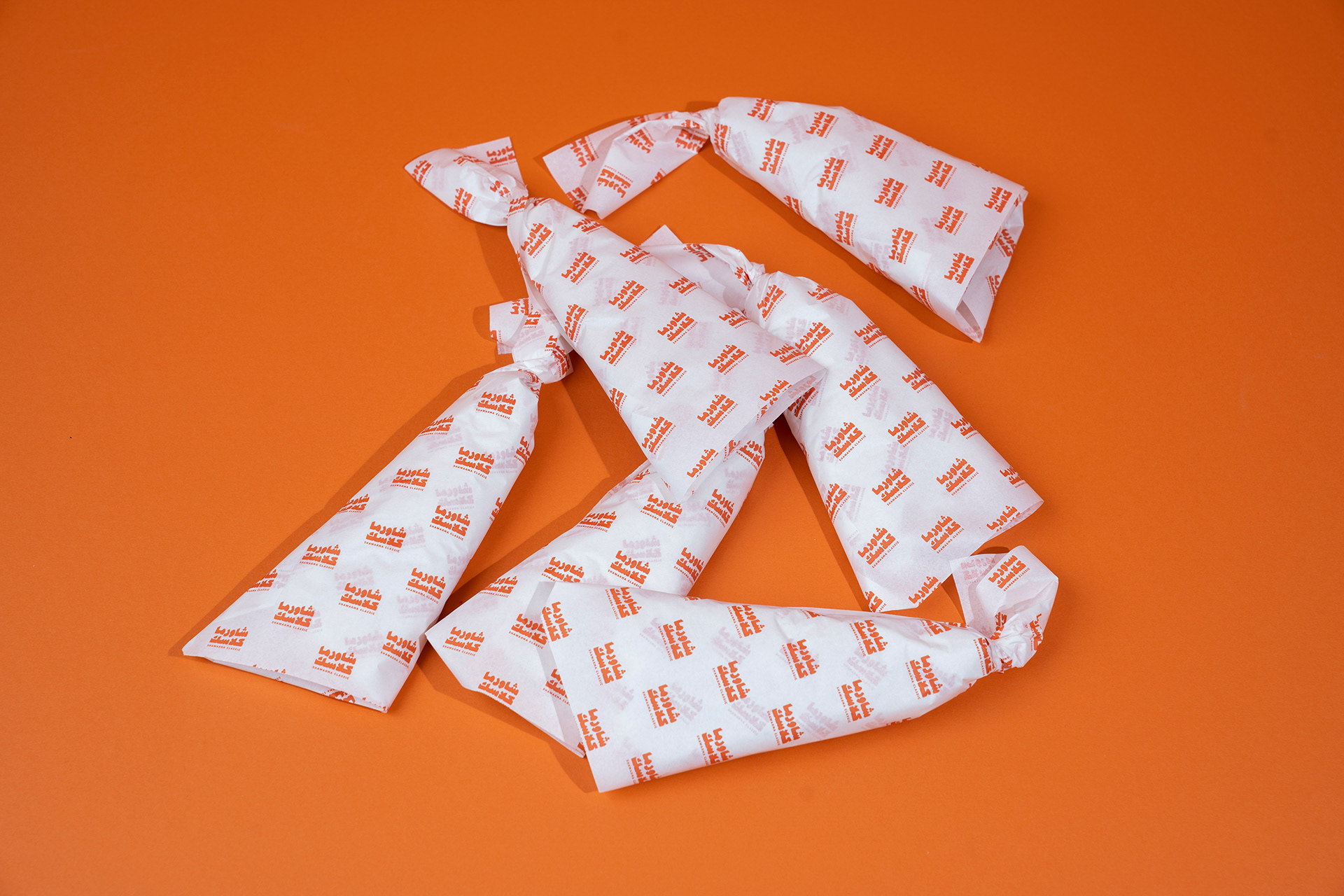
The original color palette was slightly adjusted, preserving warm tones and vibrant orange as the primary color. A circular grid system, based on cropped letterforms, was developed to generate dynamic patterns across packaging.
Creative Direction: Unkoated | Laetitia Keyrouz
Graphic Design: Chiara Vincenti Zakhia
Photography: Shawarma Classic