Tellini
2021 | Naming, Brand Identity, Packaging, Uniform, Signage
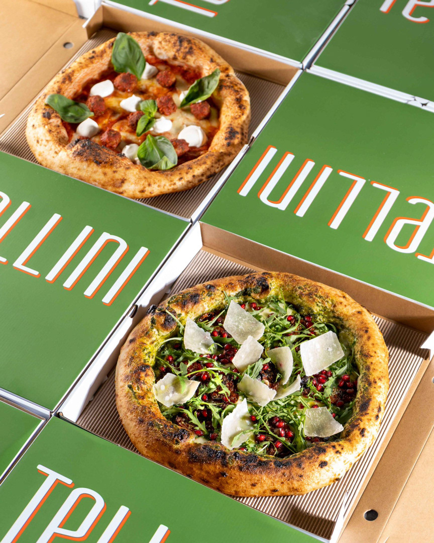
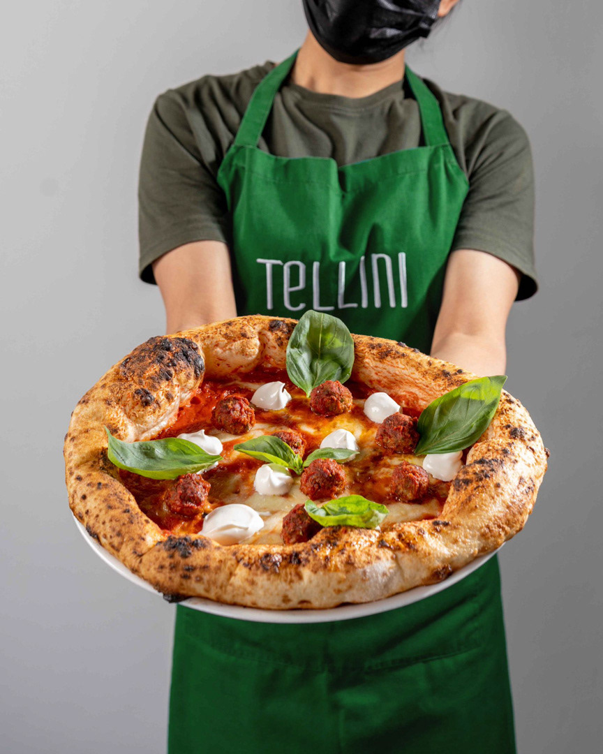
The brief was to create a distinctive visual identity that reflects the authenticity of an Italian restaurant in the heart of Abu Dhabi, while also introducing a modern, playful tone aimed at a younger audience.
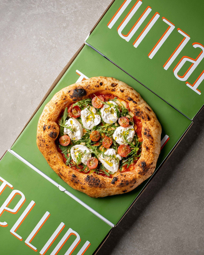
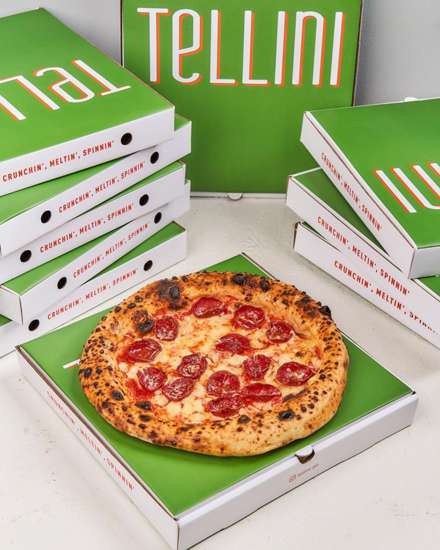
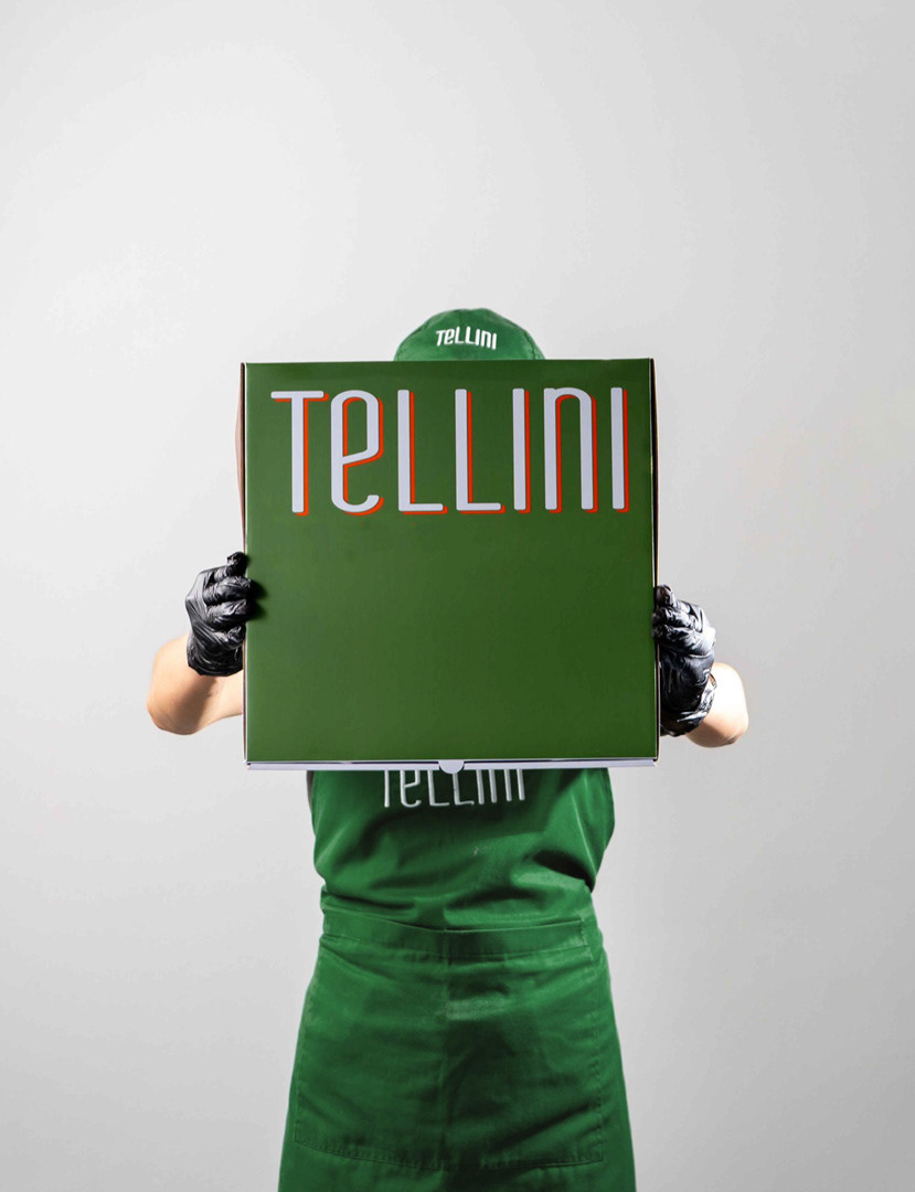
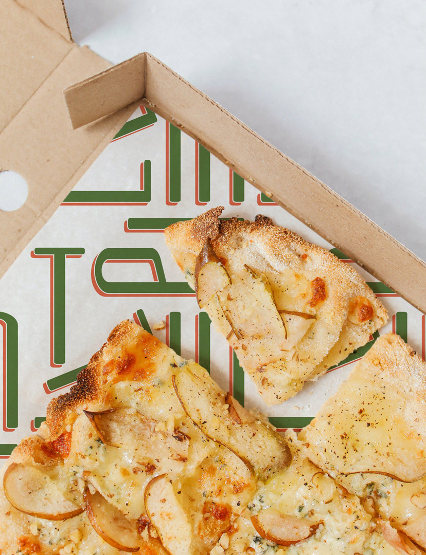
The identity draws from the visual language of traditional Italian restaurant while deliberately avoiding clichés. It is centered around a condensed logotype, developed in both Latin and Arabic scripts and defined by a contrasting, colorful outline. The logotype functions as a dynamic and recognizable stamp, often used oversized across applications.
The color palette reinterprets the Italian flag through warm tones (green, white and orange), evoking the idea of simple, feel-good food served fresh and hot. Paired with clean line illustrations referencing Italian ingredients, the system balances comfort with a contemporary take on traditional Italian visuals.
Creative Direction: Unkoated | Laetitia Keyrouz
Graphic Design: Chiara Vincenti Zakhia
Photography: Tellini

